Seven deadly sins series:
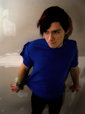
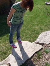
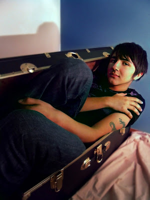
During the course of this project, my ideas greatly changed. The macabre imagery that Intended to use changed to in depth symbolism. The pictures are not what you would see as the seven deadly sins. Each picture has a meaning to me why they are connected. My goal to be abstract really connected with me this time. Each picture makes sense to me. I do not have a faith in god but the seven deadly sins are important to me, I believe these sins can break a person and make them lose their essence of who they are. Each picture shows some form of constriction. The symbolism is showing through the forms of restraint. It shows how it binds you to the sin and you can’t escape.
I believe that the pictures are strong on their own, and work as a series, the lighting is strong but on vanity I found it a little off and had a hard time compensating. As a series they are very different but I also like that to show that they are all very different sins and will cause a downfall in a very different way.
up close:
Vanity
WrathSloth
Tuesday, January 27, 2009
Thursday, January 15, 2009
Assignment:
Flash light,
I used a blue LCD flashlight instead of a regular flash light.. mainly because I didn't want the icky color of a regular AND because I couldnt fine the batteries.. haha but I really like how this picture turned out! :]
5 differents,
For these pictures I used 5 different blankets with the macro setting, I amped the colors on photoshop and tweaked the contrast and brightness on each one.
favorite colors,
I don't have one favorite color anymore, I have appeals to different combinations of colors, one of my favorites is blue white and brown, because of snow during the day, I really love the combination of these colors, they are tranquil and happy.
Back of my head,
I used macro for this picture to create the shine of my hair and opened a window next to me to let sunlight filter through the picture, i really like this one!
Wednesday, January 14, 2009
Friday, December 12, 2008
Monday, December 8, 2008
Lighting Techniques! :D
Indecicion.
Model: Breanna
For this picture i used lighting on both sides of her and the flash. I used t flouresent lighing and covered it with a plastic bag to give it a soft box lighting. I used a brighter light on the other side to illuminate her hair. I was aiming for a simple black back drop but it wasn't wide enough so i used it more as a texture. I cropped out alot of the picture and got rid of most of the distracting objects, I'm really pleased with this picture!
Starboard
Model: Randy
I used the light from the lamp on the brick wall to cast shadows and highlights on Randy's face. It brought out more texture in the bricks as well. I was lucky enough to get outside when the sun was slightly filtering through the clouds. The magazines mentioned using soft lighting and multiple sources of light. I used the lamp and the sun as my multiple sources, I got some great results!
Ribcages on Fire
Models: Randy & Brandy
In this picture I used the flash and reflected it off the snow. It caused more texture to show throughout the picture. This is probably my least favorite but i still think it is a great technique for future reference.
Subscribe to:
Posts (Atom)