Monday, December 8, 2008

Lighting Techniques! :D


Indecicion.


Model: Breanna
For this picture i used lighting on both sides of her and the flash. I used t flouresent lighing and covered it with a plastic bag to give it a soft box lighting. I used a brighter light on the other side to illuminate her hair. I was aiming for a simple black back drop but it wasn't wide enough so i used it more as a texture. I cropped out alot of the picture and got rid of most of the distracting objects, I'm really pleased with this picture!


Starboard
Model: Randy
I used the light from the lamp on the brick wall to cast shadows and highlights on Randy's face. It brought out more texture in the bricks as well. I was lucky enough to get outside when the sun was slightly filtering through the clouds. The magazines mentioned using soft lighting and multiple sources of light. I used the lamp and the sun as my multiple sources, I got some great results!

Ribcages on Fire
Models: Randy & Brandy
In this picture I used the flash and reflected it off the snow. It caused more texture to show throughout the picture. This is probably my least favorite but i still think it is a great technique for future reference.

Monday, December 1, 2008

Greek Myths: Persephone

Persephone was Zus' daughter and was kidnapped to the underworld by hates. While she was there her mother looked for her on earth. She was finally found and Hates was forced to give her back. Before she was released she was tricked into eating a few pomegrante seeds. Since she ate them she was then required to go down to the underworld once every year. During that time winter covers the earth.
I had my freind Taylor dress up in a white robe because Persephone was always portrayed with a white robe in greek myths. She was known as the "White armed" so i had her wear white sleeves. The handcuffs symbolize her permanant hold on the underworld and the pomegranet obviously symbolizes the story line. The bricks in back are grungy looking to give it a dark feel and it looks like it is expanding to symbolize she is forever wrapped around in shadow of the underworld. All in all i like this photo but i should have done some dodging and burning to make it a little stronger.


Monday, November 17, 2008

my 4 series

For my series I wanted to go outside the box and show my four major downfalls instead of just me. I looked for symbols that are only semi related to the theme to produce a different picture. I used unity and balance througout the pictures with similar colors and lighting to keep the themes together but i didnt use the exact same looks with each picture to show my irregular personality. I'm very unpredictable so i chose to emphasize it through each picture. I also used it to show how I differ from things and how I always am willing to try something new. I made sure to keep the body shots 3/4 to full veiw so that they flow together more. I am very happy to how this series turned out, i find myself becoming stronger in my photography and I can say that this project helped me find out more, not only about my art, but also myself. :]


Down and out (model: Taylor Worth)
This is one of my major downfalls, i do well of hiding it, Pessimism. I have an extreme amount of negativity on many different subjects and I always seem to find myself seeing the glass half empty instead of full. It seems to me that nothing is ever good enough. I am optimistic about other people but when it comes to myself I have a lack of positive energy. I can make anyone feel better but i only make myself feel worse about situations. I showed the symbolism with stairs. I tried to think of things that would be an outside-of-the-box way to show my negative side. I automatically thought of negativity as down then i had an epiphany... Stairs go down! so I used the stairs as a way to show my downer side to things. Another ironic thing is that... stairs also go up, so it shows that my direction of thinking automatically thinks down. I showed my glass-half-empty thoughts by positioning Taylor downward on the steps.... (THANK YOU TAY I KNOW YOU WERE IN PAIN!) I told her to give herself a hopeless and pained expression to show off my theme.. the pained part was not hard at all (haha) The dress shows her more feminine side and shows more vunerability. The way she is positioned shows that there is a long way to fall before she can get back on her feet, pessimism, once in the habit, is hard to get back up, so by showing her in a hard position to get out of shows what kind of a predicament i find myself in far too much. I like the way the lighting is cast, with her tactfully in shadows showing off her cynical mind set, and the upper part of the stairs lightened, almost showing salvation. It has good composition with her feet leading you down (another symbolic negative) to her face. This is a very strong picture (in my opinion).


precariousness (Model:Mitchell Noll)

I tried to find an abstract yet still understandable way to show the theme of this picture. One of my biggest problems is Insecurity. I thought about how many times i looked in the mirror a day and gave myself mental make overs that would cost millions of dollars. Mirrors are obvious so I didnt even let that enter my head. I thought for something deeper and thought of when I (and everyone else) analyzed themselves the most. The bathroom was an obvious blace because that is where the mirror is always located. With one final brainstorm I figured out that showertime was the most obvious for picking yourself apart, when you are alone to make contorted and discusted faces at yourself. I used my parent's shower as the location because of the glass, it distorts things and reflects lights nicely as well. I had him stand in the shower and look out obviously disgruntled. The glass distorting his body is symbolic for what he sees. I put a light in back of him to contrast the shadows more to show the human figure off as something everyone worries about. I angled the camera down to show that he's looking down on himself. Compositionally the peice is strong because it drags your eye from the bottom left corner to the top of the picture. I also really like this picture :]


Quarantine: (model: Taylor Worth, Chad, and Robbie Nolland)
This was the hardest picture to produc, not only because of the people in the background but also because of the symbolism behind it. I could not figure out another strong downfall of mine but I finally figured out one of my worst traits. My insecurity plays into this trait more than it should. I often feel much different from everyone else and from that I become self concious shy and I am very secluded. I tend to feel distant in a room full of people, like I'm not quite right there. So I chose seclusion as a downfall. I had Taylor stand still and look at the camera, almost as if she knew something no one else did, to show difference. I made her really contrasted compared to the people in back who i desaturated. I had them move to show that they really weren't there, to emphasize the saying, "Feeling alone in a room full of people" I put a light behind her to make her outline more visible to make her "glow" in a way to make her differenciate from the people in the back. The figure (chad to the right) leads the eye to Robbie who leads you down to Taylor, the main subject of this picture. The focal point shows that she feels last. I am glad this picture turned out how I wanted it to. :]
In the Dark (Model: Mitchell Noll)
I have been screwed over one too many times in my life to be comfortable. I have learned caution is important for self preservation. Unfortunately it has gotten out of control and has turned into paranioa. It has become a major problem and I find myself having panic attacks more often than i should. (haha?) I definitely saw this as a downfall. At first It was hard to think of a way to portray it but I found a good idea that is very out of the box. I used an umbrella to show what paranoia does. When you are cautious you block things out and when you are paranoid you try to block it out but all you get is a wave of scary thoughts. What I did was show the umbrella in the back, able to handle rain but if it took on hail, or anyhing too powerful it would easily get broken and washed away. Paranioa does the same thing The light in the back shows "Thoughts" showing through and engulfing his head. I like the symbolism behind this the most and was reaalllyy proud of myself for thinking of it :]


Friday, October 17, 2008

Brandon's lighting


Color Psychology!


I hope you can guess the colors... haha

Flickr contest!


Night photography!


Yellow wallpaper


In this picture I turned on a light down in my basement under my stairs. It's kind of eery down there so I thought it would be good to do with a correlation to the story... which is quite eery. At first I had planned to find some wall paper and plaster it against a wall but i ran out of time and I figured the blanket was creepy enough on it's own (the one hanging up) I had my model (THANK YOU TAYLOR!) screaming, as the end of the story did as well. The focal point is the face and hair due to the contrast of the red, black, and grey tones. The composition of the piece is strong and I beleive I acheived good balance.

Thursday, October 2, 2008

My official attractive repulsive!


Alrightttt i got all my pictures done and i even tweaked the last one! sooo here goes! :::


Attractive 1:


Sooo here's my first attractive, I call it "bliss"


I know it was my first repulsive but i just wasnt satisfied with the colors and everything, it just didnt fit... I wanted the leaves to be bright green even against the dark and icky dead leaves, it shows life during the time of death among plants, and i kinda like the symbolism plays off, it can be used greatly in today's life and just for nature's workings. I saw this as a much more successful piece when it had vibrant colors!


I think this picture has great contrast of colors with the green and deep purple, it really catches the eye and keeps the veiwer's attention. Also the composition is well layed out drawing the eyes to the big flower first (which is so conveniantly on the rule of thirds) and then drawing it down ward with the trallice. After the eye hits the ground it goes to the next flower and follows the vine up. It is perfect! It also has good unity, there is purple incorporated in the ground and dead leaves and there is green throughout the piece for balance.


Obviously at first it was just a normal picture and was quickly changed to the dead icky colors that I have up on my blog now, (which i will leave up to show what the wonders of photoshop are) I tweaked the color balance... ALOT and changed the hue and saturation on the flower. I really upped the greens and blues and cyans to enhance the earthy and vibrant effect but also made sure to have reds and purples to create a more life like and united peice.


Personally I realllllyyy like it and the colors just make me smile big, :]


Attractive 2:


I'm not sure how I've come up with the name but what kinda stuck was the title "Breathe"


To me this picture reminds me of the song "breathe" by Anna Nalick. I think because it's something that was once living and seems to have nothing left in it, and i want it to have hope, even though its a branch..... It just symbolizes hope and that just keep on breathing and everything will work out, we are never given more than we can handle. It creates a very calm and peacefull mood and that's why this strikes me as attractive, the green foliage in the background puts people to ease and the sharp detail of the branch keeps them focused. I think that it really has alot of symbolism behind it and it's more of an abstract thought, but it's why the title is so different, so that people can see past "the branch" and see the deeper meaning.


I decided to go past the artificial and into the natural and try something more down the earth, literally! I burned the picture in the areas that were really light and pulled out more detail using burning and contrast. I really really like the detail on this picture and the composition is very strong. The focal point is at the area where the leaf appears to be stuck on the inside of the branch and it points your eyes to the left hand nub of the branch. then leads your eyes down the branch, giving the eyes full veiw of the picture. There is good unity in the peice because there is a balanced amount of green on both sides and also reflected onto the branch. There is good balance as well becaus of the equally distributed green.


I really like this piece because of the deep meaning to it and the detail on the branch, it really creates alot of appeal to the picture!


Repulsive 1:


"Unmoving" I actually like it alot, there is alot of detail to the picture, and it is quite icky looking!


This is actually a reallllyyy old head stone from the mid-1800's held up with a wrought iron support. Instead of taking a picture of a typical headstone i took the picture of the back and top.


The title itself is pretty easy to understand, unmoving, like this gravestone. It has been there since the mid-1800's and it's still there and solid. Everything is unmoving, and its just showing what time can and cant do.


The composition of this peice is simple, at the top there is a yellow leaf next the the support and the veiwer looks there first. The support brings the eye down to the bottom showing the whole peice There is obvious unity and balance as there are yellows and greys included everywhere within the stone.


Repulsive 2:


Ironically enough i call this "sunshine" normally when people see sunflowers they are bright and happy and super yellow. No one ever shows the downfall of the giant flowers. Sunshine is to catch the irony and contradiction that everyone misses and forgets about. It shows the meloncholy side to everything. Although sunflowers in their fullest are beautiful and make people smile, when they die they become very sad lookng and completely opposite of what they once were. The contrast in moods it brings about with mere state changes is a perfect way to show the good and bad side to everything in life. It looked so sad when i was setting this picture up, the head was dragged downward and there were weeds choking out it's leaves, depriving it of sunlight. It seemed the perfect oppurtunity to snap a picture!

The first thing i did to this picture is darken it a bit and pull out more contrast, it was a very dull and almost foggy looking picture. I then switched the color balance pulling out blues, reds and a bit of green. I put a second, less saturated layer and placed it over the top to give it a washed out look, i erased the flower from the second layer so i would stand out more among the duller color. I gave more reds and yellows to the flower and gave it a little more saturation.

There is strong composition in this picture due to the intense focal point. The veiwer's eye starts at the top of the flower where the extreme white sky and dark flower meet. The flower's outline drags the eye down and curves around the page in a "c" form. There is good unity within the flower and leaves because there is green in both parts. Balance is a good component as well, there is an equal distribution in objects around the picture.

All in all I found this piece quite successfull. I really like the colors, message and components used to make "sunshine" I love the veiw because it's just a little different than what people would normally take. I really like the colors as well!

SO!! there ya have it! my attractive repulsive pictures!!

yay! thanks for looking and I hope you enjoyed them! :]


Monday, September 29, 2008

Attrtactive and repulsive
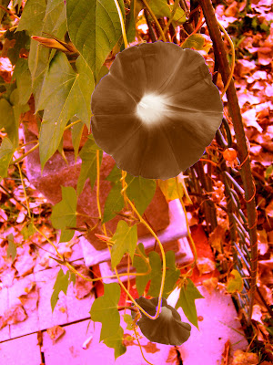

my repulsive!
This picture is more grungy in colors to give the viewer a sense of almost dying flowers, like the end of fall when nothing is bright. It gives an eery sense because , even though the flowers are not dead, its almost as if they are due to their color. The dulled greens and the heightened browns of the leaves give it that middle of November stillness. That is one of the worst times of year in my opinion, because everything is gone and barren.
This is an attractive scene and the original is much more attractive and is pretty mellow colors, i gave it an interesting color scheme and got rid of the mellow mood that the blue and green hues gave off.
Not only is It repulsive but there is a strong line that brings the eye along the piece (the trellis) and a good focal point (the bigger flower)
Attractive still to come

Friday, September 26, 2008

Corruption


This montage goes along with my first following the same idea of corruption in growing up, but i used different symbols like money and bullets. Things that, whether we believe it or not, shape our values and beliefs I used m brother once again as the main focus of innocence and used the same picture to emphasise the motif of the montages. The ripped paper on the sides shows the irregularity of growing up and obviously the money and bullets show the corrupt side of things.

The focal point is on the rule of thirds and it leads the eye downward toward the money. there is balance and unity in the piece and good composition and color.

Thursday, September 25, 2008

wow


sooo i finally uploaded my first thing for this term.. hahh.. took long enough! >_<


Tada! my first montage!
It has song lyrics to emphasize my meaning and i show my brother in the corner to show the simplicity of youth. I took pictures of myself with lots n lots of make up and then a few without as much then cut it in half so i had half makeup half more natural. It shows that we hide who we are as we grow older, its almost as if we begin to get more corrupt and don't show our true self, we tend to get lost in the farce of everyday life and forget to be who we are and pretend to be something that we are not. The child in the corner shows raw innocence and how we lose it when we get older.